Each datasheet includes markup, keyboard behaviour, and a test matrix across screen readers, browsers, and devices.
What you get
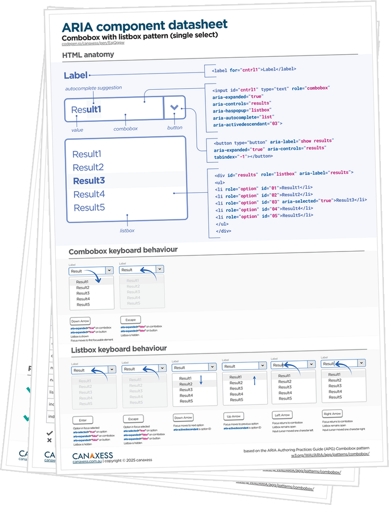
- A PDF datasheet with the HTML structure, visual interaction behaviour, plus a development and testing checklist
- Access to a CodePen to explore the pattern and copy usable code into your project
- A comprehensive assistive technology test matrix covering multiple browser and AT combinations. Some components include up to 94 individual checks, saving you hours of research and retesting
- Confidence in the component when our guidance is followed
Why they work
Building accessible UI components can feel like a time sink. You start with a pattern you think you know, then lose hours to tiny details. Which element owns focus, which state change and when, which relationships make assistive technology behave, and which browser and screen reader combination break the moment you deploy.
That's where these datasheets provide their value. They turn a goal of building an accessible component into a concrete development plan you can implement with confidence. The HTML structure, the required ARIA roles and states, the keyboard behaviour, and a checklist of what must update as users interact. It’s not more theory. It's the missing "spec you actually use" while you're coding.
The payoff is the evidence. These datasheets aren’t based on assumptions or a quick skim of the ARIA Authoring Practices Guide. They’re built from hours of hands-on testing by accessibility specialists across real screen readers and browsers, including NVDA, JAWS, VoiceOver, and TalkBack.
Instead of rediscovering what breaks and what differs, you get a clear compatibility matrix with pass/fail outcomes for the behaviours that matter. That’s time, retesting, and hard-won expertise you don’t have to burn again.
And when you're pushing for sign-off, it gives developers, QA, and accessibility reviewers the same source of truth. Less debate, fewer late surprises, and a clearer path from "It works on my machine" to "we can release this".
How to use them
Guidance for developers
Start by skimming the overview and anatomy section so you have a clear mental model of the component, its parts, and the states you need to support.
Next, implement the HTML structure as shown and treat labels, descriptions, and element relationships as required, not optional.
Build the interaction behaviour next by following the keyboard flow step by step and implementing focus management so Tab, Arrow keys, Enter, Space, and Escape behave consistently.
Once behaviour matches, add the ARIA roles, states, and properties from the pattern. Keep ARIA synchronised with UI changes so the accessibility tree always reflects what’s on screen.
Guidance for accessibility testers
Use the test plan as acceptance criteria by running the keyboard steps exactly as written, confirming focus order, and checking expected announcements.
If required use the screen reader compatibility matrix to validate the combinations you support and document any known differences. This helps everyone understand what is consistent, what varies, and what to watch for during sign-off.
Digital download
Your UI component datasheet is a digital download, available immediately at checkout. Once your purchase is complete, you’ll get instant access and can start using it right away.
Because this is a digital product, we generally don’t offer refunds, so please choose carefully before purchasing.
That said, we genuinely want you to feel confident you've got value from it and that it’s helping you build and test accessible components. If you feel it isn’t helping for any reason, please reach out and we’ll do our best to sort it out hello@canaxess.com.au